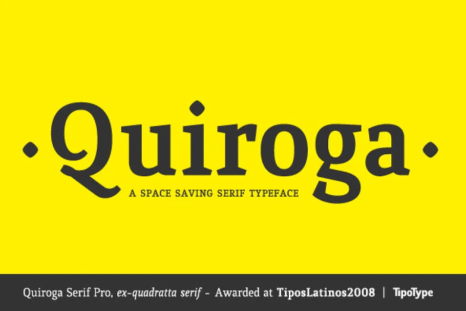
About the Quiroga Serif Pro Font
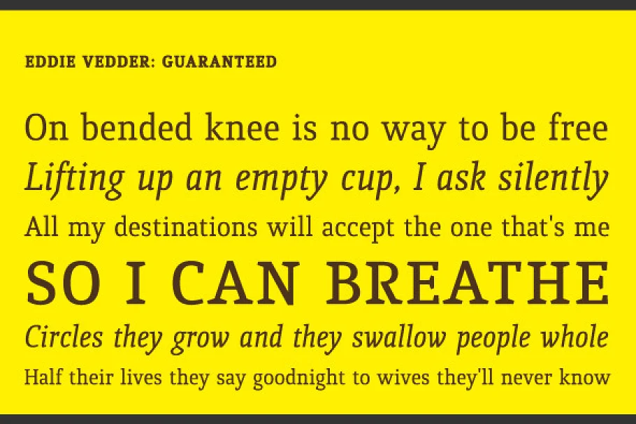
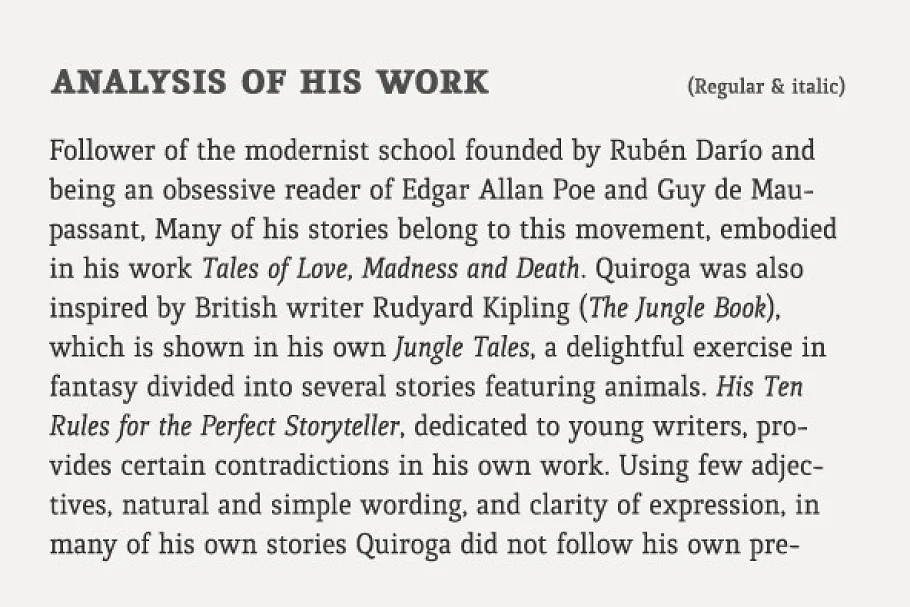
Quiroga Serif Pro Font typography was designed for continuous text, legible at medium and small sizes, with great saving of space, optimized for 6, 8, 10, and 12 points.
The morphology is a mix between tradition and innovation; Quiroga Serif Pro Font has a vertical axis, thick serifs, tall x-height, light modulation, and a lot of internal space between letters: the key to improve legibility at small sizes.
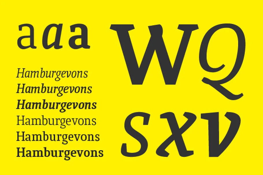
Formally, my idea was to make a serif type that had a unique color, this is visible due to the light modulation. This is also complemented with the incorporation of not common, alternative signs.
Some parts of the letters that usually curb or diagonal were made horizontal (for example a, q, p, etc.), this makes the eye of each character to be wide and unique.


The serifs (wedge type) suffered diverse variations during the process. In the beginning, they were thicker and ended vertically, but this caused a lot of printing errors.
And so we decided to modify them by giving them an angle to avoid visible errors in medium and small sizes.
The ch and ll ligatures were rescued because they are a part of our current Spanish alphabet.
The historic ligatures and stylistic alternates give different options to users who want different alternatives within a text.
The accentuation signs were composed in a middle line above all signs to avoid visual shock.
We also gave plenty of importance to small caps numbers, mathematical signs, and currency signs so that they could interact well.
Quiroga Serif Pro Font demo is for PERSONAL USE ONLY!.
More Fonts:
- 25 Best Number Fonts for Displaying Numbers
- Top 20 Best Fonts for Resume
- 100+ Best Professional Fonts To Level Up Your Designs
- 295+ Premium Ultimate Font Collection Free Download
- 27+ Best Premium Signature Fonts for Designers
- 17+ Most Premium Sans Serif Fonts for Modern, & Clean Designs
- 45+ Best Modern & Futuristic Fonts to Give your Design a Stylish Look
- 20+ Most Decorative Vintage Font Collection
- 40+ Most Popular Fonts of 2020
- 10 Best Premium Fonts for High-Quality Logo Design

