About the 1790 Royal Printing Font
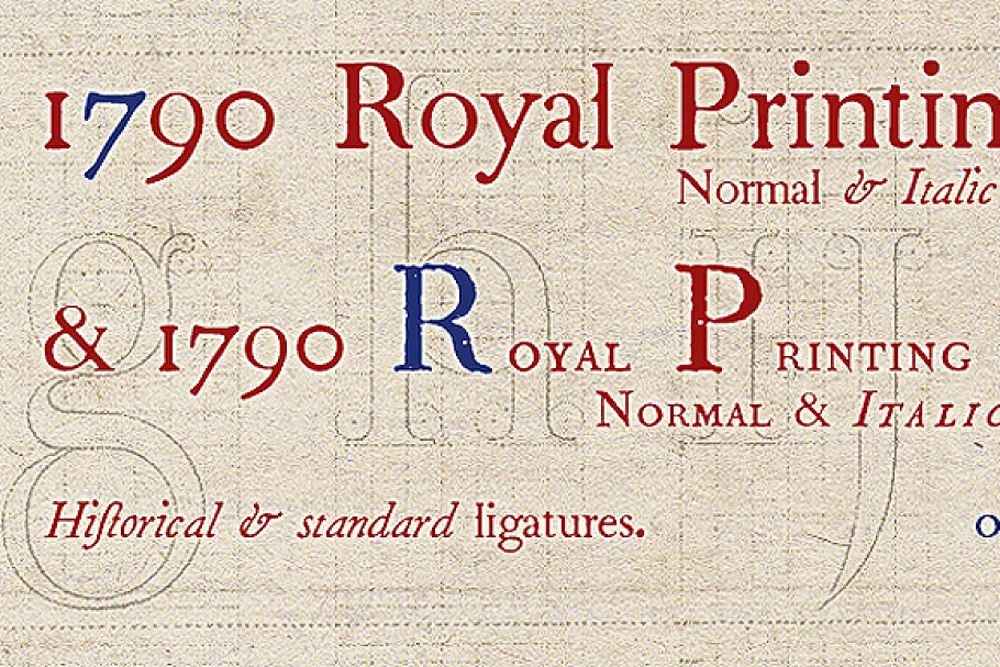
From 1702 to 1811 the French “Royal”, then “Imperial”, Printers, neglected Garamond and Fournier’s designs and used only the font called “Romain du Roy”, carved (1693 to 1723) by Philippe Grandjean by order of the king Louis XIV.
“1790 Royal Printing” was inspired by various variants of “Romain du Roy” that were in use during this period. Our sources were mainly official and legal documents printed in the late royal period, and at the beginning of the French revolution.
There was no bold style. The “1790 Royal Printing Caps” fonts contain small caps, plus titling caps for headlines as “1790 Royal Printing” capitals are intended to be used preferably for text.


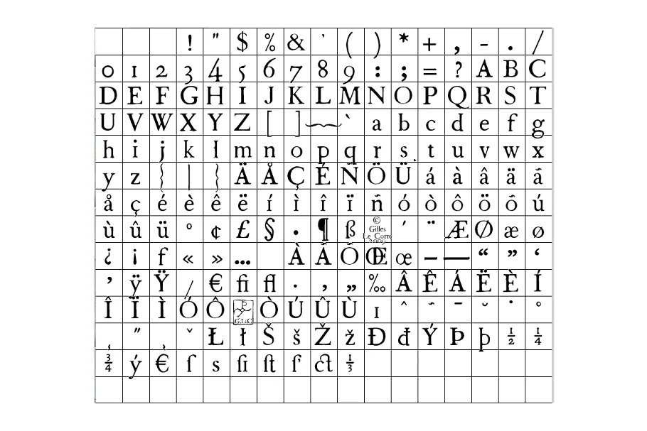
Normal and Italic styles are containing 214 Glyphs, with fi and fl standard ligatures, plus s long and s long ligatures.
1790 Royal Printing Font demo is for PERSONAL USE ONLY!.
More Fonts:
- 25 Best Number Fonts for Displaying Numbers
- Top 20 Best Fonts for Resume
- 100+ Best Professional Fonts To Level Up Your Designs
- 295+ Premium Ultimate Font Collection Free Download
- 27+ Best Premium Signature Fonts for Designers
- 17+ Most Premium Sans Serif Fonts for Modern, & Clean Designs
- 45+ Best Modern & Futuristic Fonts to Give your Design a Stylish Look
- 20+ Most Decorative Vintage Font Collection
- 40+ Most Popular Fonts of 2020
- 10 Best Premium Fonts for High-Quality Logo Design

