The Sketchnote Typeface was born of necessity: I needed a series of hand-drawn fonts to produce my book.
So from the get-go, the typeface was made to be practical, to convey the human character of my handwriting and unique lettering but with all the benefits of digital fonts.
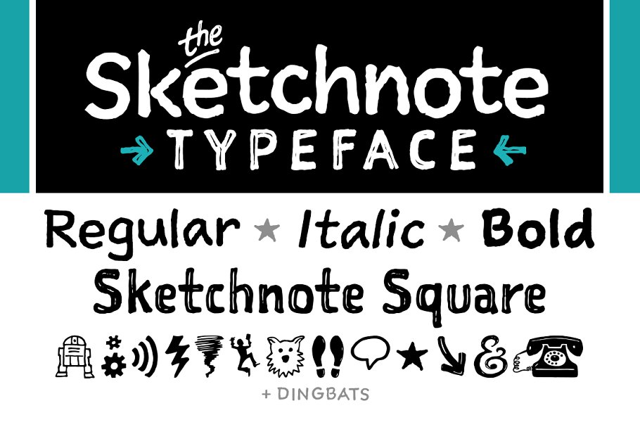
The family has five fonts:
- Sketchnote Text in Regular
- Sketchnote Text in Italic
- Sketchnote Text in Bold
- Sketchnote Square
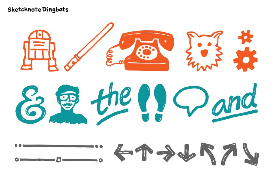
- Sketchnote Dingbats
The texture of Sketchnote is the result of actual ink-spread on paper, captured in scans of the written letterforms and left intact during production to preserve that feeling. Under the hood, the texture was carefully edited by hand, eliminating outline errors and keeping the point count low for optimal performance. Rest assured; these fonts are crafted to the highest industry standards.
TEXT, ITALIC & BOLD
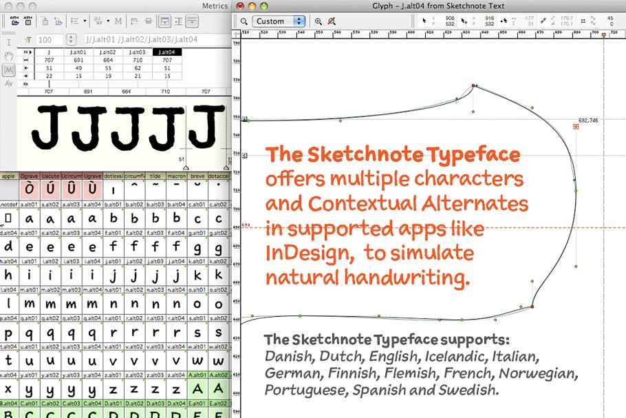
Sketchnote Text is a friendly, casual script with a bouncy baseline and a warm texture. To emulate natural handwriting, OpenType features automatically switch between multiple versions of each letter or number, with over 240 alternates in each text font. OpenType kerning classes are used with unique kerns made to tame pairings of all those wily alternates for consistent spacing.
sketchnote SQUARE
Sketchnote Square is a bold, somewhat compressed headline type that complements the text fonts. Drawn instead of written, the characters in Square have neat little happenstance voids within the strokes.
sketchnote DINGBATS
Dingbats feature a handy selection of fun icons, rules, and arrows some functional tidbits for your design projects.
SERVING SUGGESTIONS
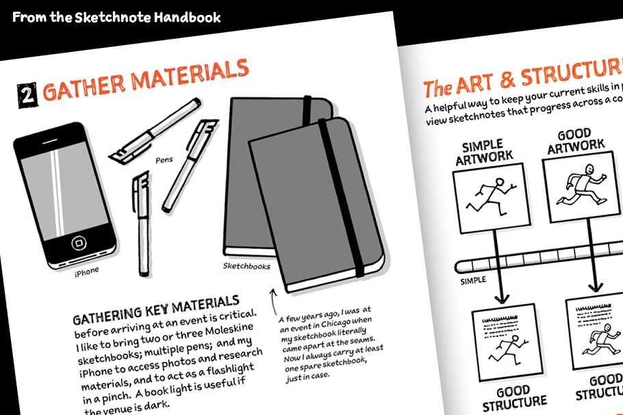
Sketchnote Text is intended for use at smaller sizes, for longer bits of copy in magazines, books, and websites. Sketchnote Square is best used at larger sizes for headlines, titles, packaging, etc. Use them together for a consistent style or paired with other typefaces. Either way, Sketchnote is great for a variety of projects where a handcrafted aesthetic and ease-of-use are desired.
This demo font is for PERSONAL USE ONLY!.

