Saygon Text Font Family is the logical consequence of our CA Saygon (Display) Family. Saygon Text Font is much calmer and therefore also suitable for reading texts and every day’s editorial tasks.
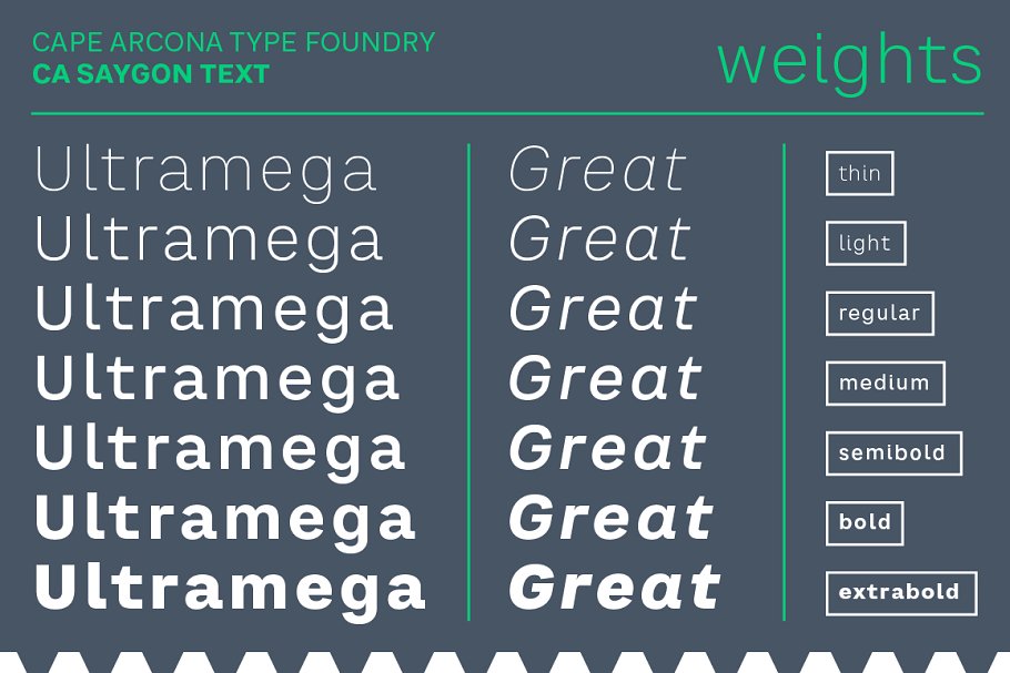
Basic shapes and proportions were adopted from Saygon and continued in such a way that a font family from Thin to Extrabold resulted. A fundamental inspiration was early static grotesque typefaces such as Akzidenz Grotesk.
Nevertheless, the typeface was by no means intended to have a historical look. Thus, a relatively high x-height was chosen, which makes the typeface quite economical in type-setting, since the letters appear visually larger.
A relatively small line spacing with good legibility can be achieved due to the small ascenders and the low cap-height.
Letters like f and t, which otherwise tend to end in curves, were given right angles, which on the one hand meets certain design elements of the original Saygon, but on the other hand, also refers to contemporary trends in typeface design.
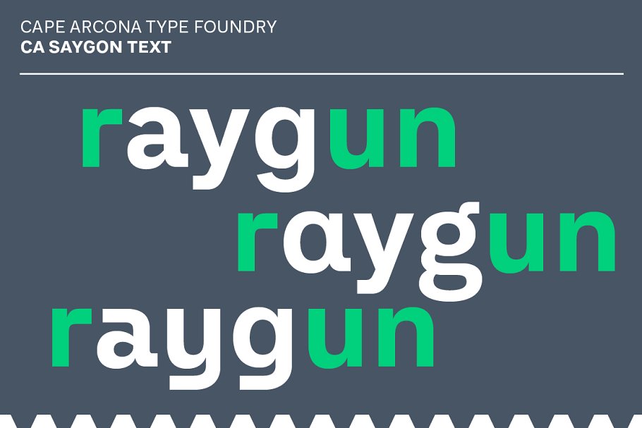
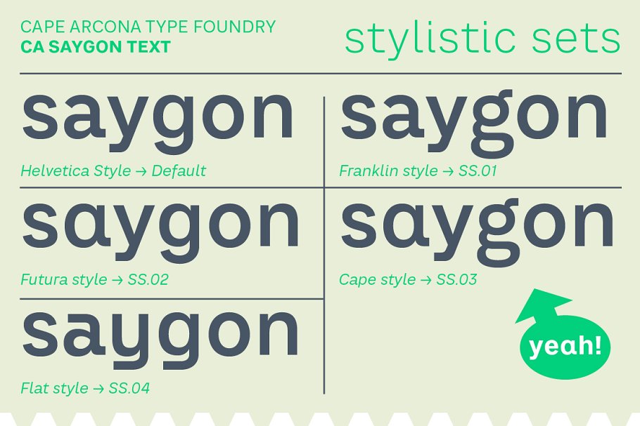
A special feature is the five styles in which CA Saygon Text can be used. The default setting is the Helvetica style, with two-story a and g. The Futura style has a single-story and a two-story g accordingly.
The third style with two-story a and three-story g is called the Franklin style. But the real highlight is the Cape style with single-story a and three-story g – a real rarity up to now. Let yourself be inspired by this unusual typeface.
If you like it even more progressive, you should try the flat style, which continues the right angles in a, g, and y as well.
This demo font is for PERSONAL USE ONLY!.


