Soft and rounded, geometric and delicate, Forma is the right font for colorful and exceptional designs.
The letters “g” and “y” have a unique separation in the descender, making the letter set rather unique. It’s these kinds of details that make fonts like this one so memorable.
Neue Haas-Grotesk, the precursor to Helvetica, that flagship of corporate design, has enjoyed a spirited revival.
Now we reach back to explore Forma—a 1960s Italian neo-grotesque. Somehow this warm, rich sans serif did not make it to the digital era—until now.
Forma DJR was crafted to capture the flair and precision of the original Nebiolo design while adding interesting details observed in the printing process.

Getting the Lead out.
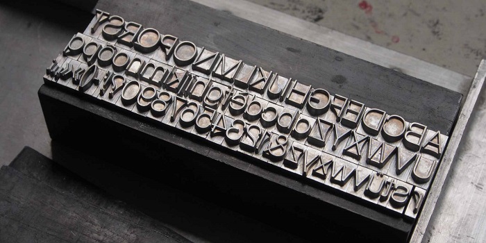
Working directly from metal type was a first for us, but it revealed how Forma had been adapted for different sizes and different weights, helping us to understand some of the key design features of this historic face.

If you feel like Forma is just not enough like Helvetica, DJR‘s revival features a few key alternate glyphs: with a chin for the G, a rounded stem for the R, and a two-story a.
Forma DJR also has an alternate tailed j not shown here. These small changes give a surprisingly different feel to the body of the text.
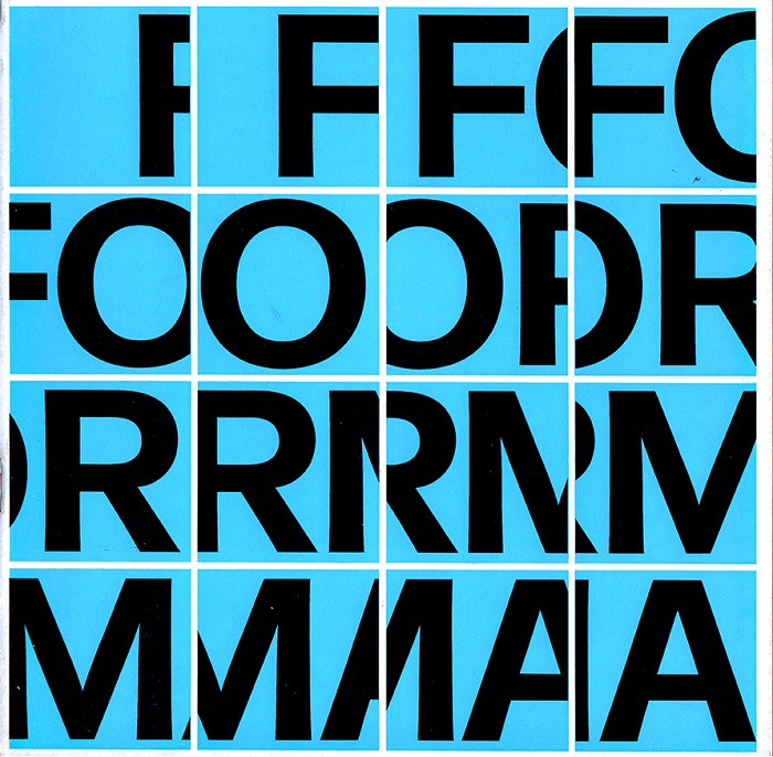
The design team that advised Nebiolo toward the end of the foundry’s existence produced some wonderful promotional brochures for Forma, the first product of the collaboration.
Whatever their influence on the final design, these are amazing pieces of type promotion.
This demo font is for PERSONAL USE ONLY!.

