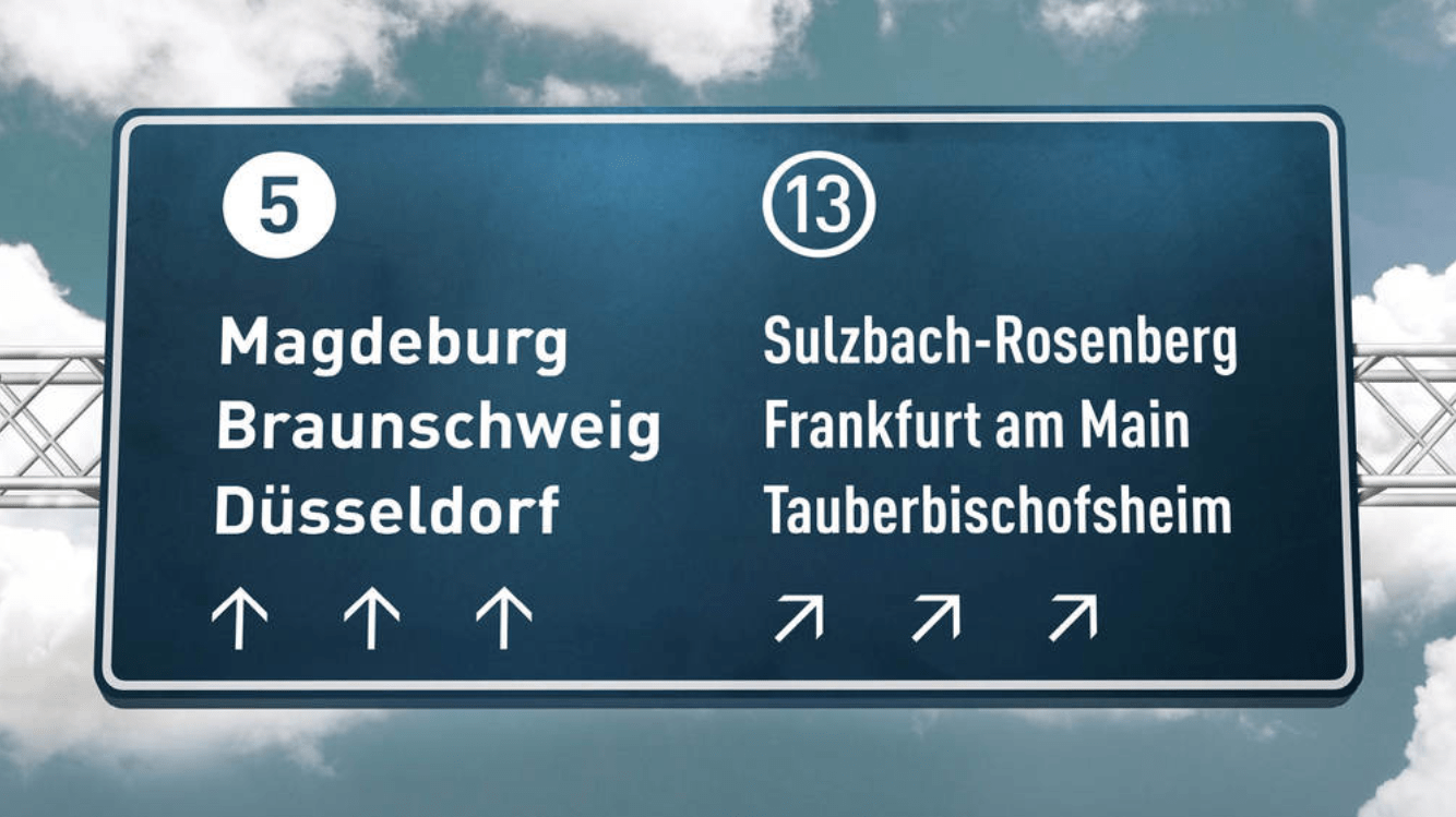
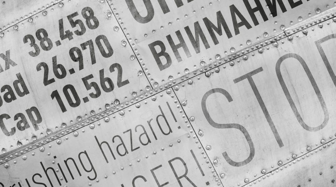
In form, FF DIN differs from previous versions primarily in its optical adjustments—horizontal and vertical strokes are better balanced and overall its curves are smoother.
Despite its primitive, technical appearance and a clear reference to German motorway signage, FF DIN quickly became a phenomenon. The typeface has pervaded corporate and publication typography and can be seen in posters for cultural institutions.
In 2011, the Museum of Modern Art in New York added to its permanent collection its first digital typefaces. Due in part perhaps to the immense popularity gained by FF DIN since its release in the mid-1990s, it was one of just 23 designs to be included.
FF DIN debuted at MoMA as part of the “Standard Deviations” installation in the contemporary design gallery. In 2015, the family was enhanced with an addition of two new weights and new Greek extensions. In 2016, German type designer Yanone published an Arabic version of FF DIN with the FontFont foundry.
FF DIN demo font is for PERSONAL USE ONLY!


